
Cosy Builder Closedown Report
Written in September 2023, and published in August 2024.
Cosy Builder had a major control refactor after this was written, so the details below may not represent the demo. Play It Here!
Design
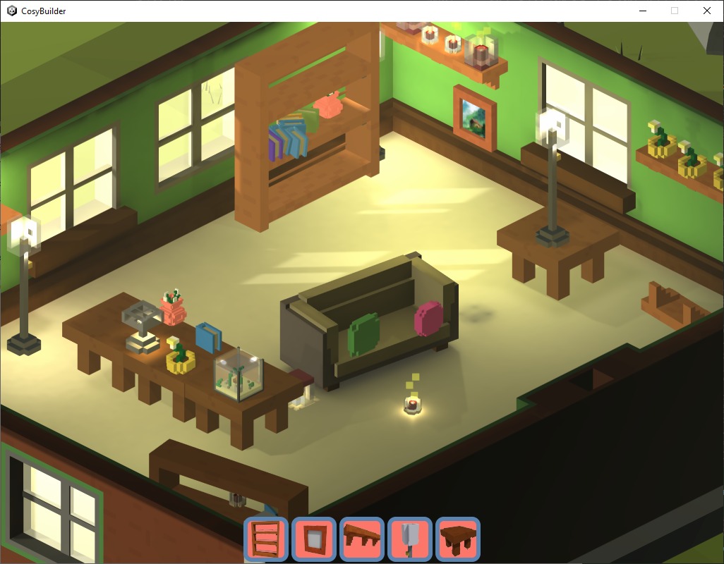
The initial idea for this game was a ‘Interior designer with Photo Mode’. Set up your room the way you’d like it, then take some photos.
Here are some high level design pillars, and examples of their impact on the game.
Pillar: Low Complexity
- Give the user a static playground and a limited number of toys, but add some dynamic elements to the toys. Avoid the simulation type game; e.g. The Sims, Paralives. The scope should be small, and controls and interface should be limited.
- Progressive disclosure. Constrain the inventory items to the view of the scene. The player can ‘focus’ on a placed object (e.g. shelf, table) which opens up different inventory options. Players can zoom in multiple times for more granular decoration. Unlock new placed objects (and therefore more inventory items) as the game progresses.
- Remove all concepts of currency and values from the game. No numbers or resource tracking. This reduces friction and decision making. Performance will limit the number of items spawned, but elements in the inventory can be greyed out when at max to handle this.
Pillar: Rewarding Exploration
- Photo mode means a first person view, so give the player other interaction options with the room that are confined to the first person view.
- Teach through curiosity. Expand the game depth by rewarding players for finding things.
Pillar: Sandbox, with emergent elements.
- Physics enabled for all* objects. Allowing the player to throw objects, knock over objects, and make mistakes when ordering their scene, but any chaos which is created should be easy to reorganise.
- ‘Make the static scene more dynamic’. Objects added to the scene will have dynamic elements; animation, lighting, and interactions. Lighting is a core part of the dynamic elements in the sandbox.
- Item spawning is constrained to the current focus, but the player is not limited to the movement of objects in the scene. If they want to take a book off a bookshelf and throw it across the room, let them.
Reference: Layering complexity with Thronefall
What’s the game?
The prototype focused on the systems of the sandbox, rather than the a classic game loop. There are a number of ways you could gamify the sandbox, but this was my favourite,
You are an interior designer, and you have a client who has asked you to decorate a room in their new home. You get a client portfolio at the start of the level; who they are, their interests, favourite colours, etc.
You have all the time you need to decorate, and when you’ve finished, you take some photos of the room. You have a limited number of photo slots. When you’re ready to go to the next level, you go out the front door and sit on a chair in the porch. You then get a score based on the photos you’ve submitted.
Programming
Unity was the chosen engine for this project, with the Universal Rendering Pipeline (URP). This combination will be the default for all projects moving forward.
Technology Stack
| Type | Name | Description |
|---|---|---|
| Engine | Unity | |
| IDE | Visual Studio 2022 | All C# coding |
| IDE | Visual Studio Code | YAML CI/CD scripts |
| Source Control | Git | |
| Repository | GitHub | |
| CI/CD Automation | GitHub Actions | |
| 2D Images | GIMP | |
| 3D Modelling | MagicaVoxel | |
| 3D Model Tidying | Blender | Cleaned up MagicaVoxel assets, and created UVs |
| Audio Editing | Reaper | |
| Audio Editing | Audacity |
Core Unity Packages
A few of the key packages used in the project,
| Type | Name | Description |
|---|---|---|
| Rendering | Universal Render Pipeline (URP) | |
| Terrain Modelling | Polybrush | |
| Shader Editing | Unity Shader Graph | |
| Cameras | Cinemachine | |
| Asset Packaging | Addressables | |
| UI | Unity UI Toolkit | |
| Input | Unity Input System (new) | com.unity.inputsystem |
| Debug | Dear ImGUI | com.realgames.dear-imgui |
| Lighting | Enlighten Realtime GI | No baked lighting, Enlighten is OOTB Unity |
Unity Engine
- Why Unity?
- Already had experience in the engine.
- Loads of tutorials from content creators on YouTube.
- Pricing change controversy likely to change the direction of the company
- Unity lends itself to low-fi art styles more than Unreal, and the asset store has lots of these types of assets.
- Opportunity to expand C# knowledge, rather than specialise in Godot’s language, or Blueprints.
- Why Universal Render Pipeline (URP)?
- Opportunity to have a little control over the rendering pipeline in the long term.
- Not making high fidelity games (else I’d use Unreal).
- Unity is likely to invest in URP as their ‘standard’ rendering offering for the future, e.g. it has DOTS support where SRP doesn’t.
Systems were written in C#, Visual Graph for Unity was not used. Shaders were written using Shader Graph.
Two Singletons were used in the game; GameManager and CursorData.
GameManager controls scene and camera transition, and has public methods allowing scripts to change Input state for the game. See Player Controls for more details.
CursorData controls runs ray casts on each update, and has public methods exposing these types of ray casts to all scripts. Ray casts with different layer masks are required in different states of the game.
Code Standards should have been defined earlier in the project to prevent decisions about naming and structure of code. Code Standards are now in place.
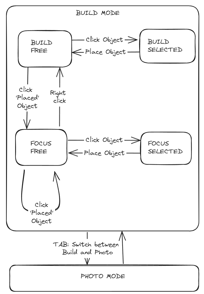
Challenge: Managing State
State was a big challenge. As mentioned above, having two distinct state systems for the Player Input and the Game was niave. These systems should have been designed and unified early, likely in the GameManager.
Early state concept Below is an early concept of how the Game states would work. The final game has roughly the same state structure, but this should have been overlayed with Input states.
Challenge: Scriptable Objects linked to Prefabs
On code review, one of the uses of Prefabs and Scriptable Objects stood out as an anti-pattern. Objects in the inventory are linked to scriptable objects which are in turn linked to prefabs for objects to instantiate.
This lead to scriptable objects being loaded in via an Addressable, so they the reference could then be found for the prefab. The better was of doing this might be, Inventory -> Prefab -> Scriptable Object
Prefabs in general were very useful, with one inconvenience found later on in the project - it’s difficult to get up inheritance for prefabs without starting from scratch. The prototype has 10+ prefabs for objects, all with roughly the same data, so an inherited parent would have helped to unify these. In the next project, define and use a prefab hierarchy earlier.
Challenge: Specialising too quickly
All objects in the game have a CbObject script attached to them which holds parameters for that object, parameters in this script are often used to determine actions to take when the objects are clicked.
Here is the component structure for these objects,
RootGameObject
-+ Script (CbObject)
-+ RigidBody

-> ChildGameObject
-> -+ Mesh Renderer & Filter
-> -+ Mesh Collider
An issue which led to a lot of refactoring was the requirement for objects with multiple focus points.
Ray casts would return the mesh collider of an object (attached to the ChildGameObject), then the system would immediately grab the CbObject script on the RootGameObject to pass between systems. When objects had to be extended to have multiple ChildGameObjects, all with colliders that could be independently clicked, the references to which collider had been clicked was lost, because we generalised to CbObject too early in the process.
Optimisation & Debugging
Limited optimisation was run on this project, as future projects will likely be more intensive, so it shall be picked up then.
The Unity Physics Debugging system was useful when debugging where colliders were interacting with objects in the scene.
Camera
Cinemachine was the main camera tool used, as many cameras and blends were required.
Build Camera
Isometric camera following a target, the target is set to move along a movement plane so the camera maintains a consistent Y value.
Two inputs for camera movement,
- Keyboard, with WASD/arrow keys. Rotation is on Q and E keys.
- Mouse, hold right click and drag the world around below the camera.
Focus Camera (per object camera)
Each focusable object has one or more cameras in perspective mode. They target a point (an empty game object) set in the object prefab.
Focus camera notes,
- An object with multiple focus cameras will pick the ‘best’ to avoid cameras being activated when behind walls. This is done by sending a ray cast from the camera target in the direction of the camera, and getting the distance to the closest object hit. The camera with an object furthest away from them is preferred.
- Camera angles can be changed by moving the mouse to the edges of the screen, this is used for precision placement of objects.
- Some objects have orbital focus cameras (table, fish tank), and some have static, front facing cameras (shelf, sofa).
First Person Cameras
There are two cameras in first person mode; one for walking with static vertical movement, and one for talking photos, with fixed movement and a crosshair that can be aimed. These are ‘Walk’ and ‘Photo’ modes.
Functionally the cameras do the job, but there are a few problems with them,
- The cameras are attached to two different parent game objects, even though both cameras follow the player, so have no reason to be separated.
- Moving between out of Photo move should reset the cross hair, but this doesn’t appear to work.
Challenge: Blending cameras with Cinemachine
The choice was made to use an orthogonal camera for the ‘Build’ view of the game, which would zoom into perspective cameras for any ‘Focus’ views.
Cinemachine cannot blend between orthogonal and perspective cameras cleanly, so a workaround was set up,
Build Camera (Orthogonal) -> Cut To Blend Camera (Perspective) -> Ease In Focus Camera (Perspective)
The cut from the Orthogonal to Perspective camera would be disguised by a screen wipe, then the Perspective -> Perspective blend would work properly. This is currently working, without the screen wipe implemented.
Player Controls
Two distinct control schemes are used in the game. Here are the final control instructions:
Note (August 2024): Controls have been removed, as they were refactored during the CosyBuilder controls redesign
The control scheme started with raw controls being read, then moved to the new input system which aligned 1 to 1 with game states (see Managing States), and then was refactored to have multiple states active simultaneously.
Here is the final list of input states,
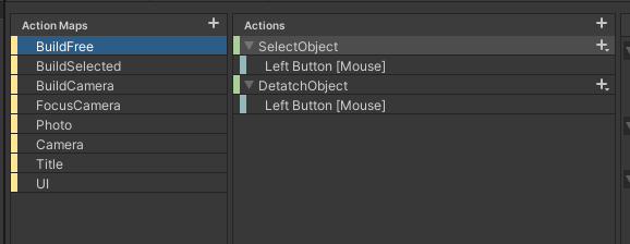
Having two similar but disconnected state systems is bad practice, but the project was so advanced before this was realised there was too little time to refactor. Future projects will design and test the input scheme much earlier.
Challenge: Clicking and Holding
For a player clicking is the most obvious mouse action to play with, but holding the mouse button to perform an action appears in fewer games, and as such is less intuitive.
The hold actions (detach object and rotate object) suffered from lack of feedback to the user. Animation and audio cues could have been added to these actions to improve the user experience.
User Interface (UI & UX)
Unity UI Toolkit was used for all UI elements.
Style
The chosen colour scheme was a common two tone, combined with a cartoonish font to give a not-so-serious feel to the title screen.
Living Coral (#FC766A) CORE Pacific Coast (#5B84B1) SECOND
Title

Button

Limited text is used in the game, so font was not given much consideration. A ‘long shadow’ effect in Gimp was added to give a more depth to the UI elements.
Concepts
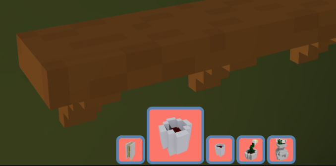
Inventory
The core inventory concept below largely made it into the game. Due to how the inventory items were limited, sorting was not required for the prototype.
Initial concept sketch,
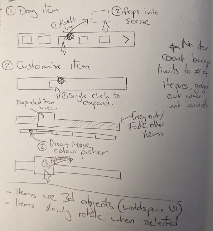
Object Customisation
Ideally, the inventory would have in-world instances of the objects. This would allow players to customise colour and style in the inventory before dragging into the scene.
The concept below is an alternative, an object instantiated from the inventory can be dragged to the bottom of the screen and would ‘dock’, at which point some customisation UI would appear and the instance could be changed.
![[uiConcept.png]]
Engineering
One key issue was world space elements cannot be used in the UI toolkit. As all the images in the UI are taken directly from MagicaVoxel, they are light grey in the UI as they have not had colour applied by their shader.
This is an excellent series of videos explaining the UI Toolkit, Unity UI Toolkit Beginner’s Guide 1: Layout & Style (youtube.com)
Player Feedback
The ‘Drag to Spawn’ nature of the inventory was counter-intuitive to some users. This could have been helped with animation during the drag.
Another solution would be clicking an object to spawn it in ‘docked’ in front of the user, to allow customisation before spawning, but this is a two-click solution which would be slower than the click-and-drag option. Click-and-drag allows users to spam spawning objects, which could be fun!
Art
Art was constrained by time, this was primarily a systems prototype. However, there were some thoughts on style requirements,
- Basic objects, clearly understood at a glance
- Emphasis on lighting
- Achievable consistency
- Un-texture assets to lower complexity, and align with visuals of the Low-poly Nature asset pack
The project used Voxel based assets, created in MagicaVoxel. This would allow simple model creation, colouring, and easily maintainable consistency.
Modelling with Voxels
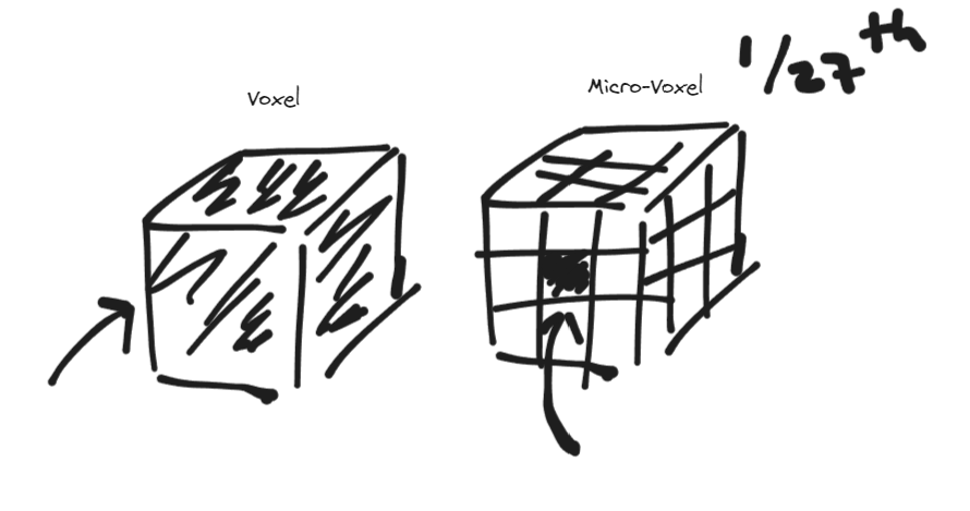
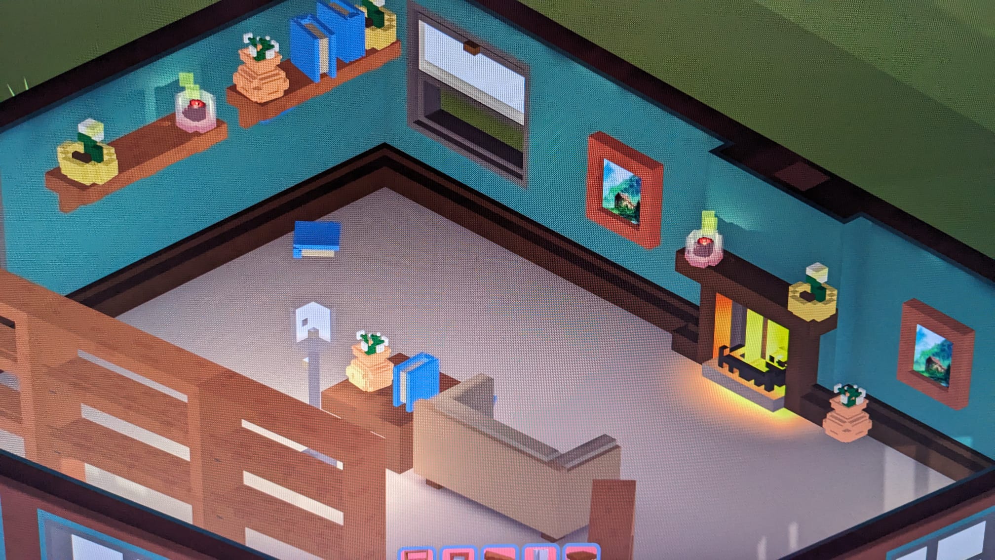
MagicaVoxel is a simple voxel model creator. For visual consistency, assets would contain squares shapes where possible. Ideally, squares would confirm to a multiple of 3. For example, the walls were 30x30 voxels in width and height.
This style was confirmed by some tests. The 3x3 walls align to a fantasy Animal Crossing style, where 4x3 leans closer to the realism of The Sims.
3x3 Walls
4x3 Walls
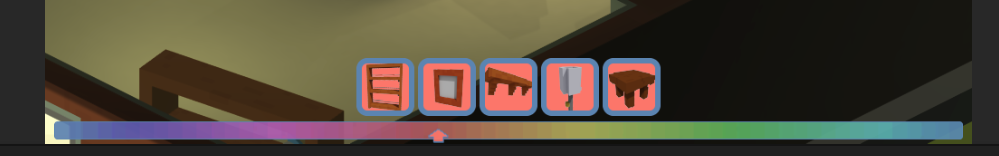
Where smaller, more detailed objects were needed, a Micro-voxel was used. Rough rules for using Micro-voxels were,
- Build Mode: Voxels only.
- Focus Mode Zoom 1: Voxels, with Micro-voxel for detailing.
- Focus Mode Zoom 2: Micro-voxel only.
Ultimately, these visual consistency rules were broken when required, but the overall style of the game still ends up feeling visually consistent.

Challenge: 3D Model Workflow
As simple as creating assets was in MagicaVoxel, cleaning them up for the game was more difficult.
A raw mesh looks like this,
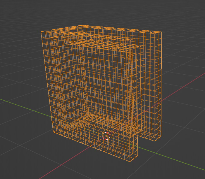
A Blender add-in called ‘Vox Cleaner’ was used to clean up the model and generate the UVs. TheStrokeForge - Vox Cleaner
This works really well for the mesh, but due to the way colours are baked into voxel assets, the UV was components were packed without any padding. This lack of padding lead to light leakage, and seams in some of the wall assets.
Padding Issues
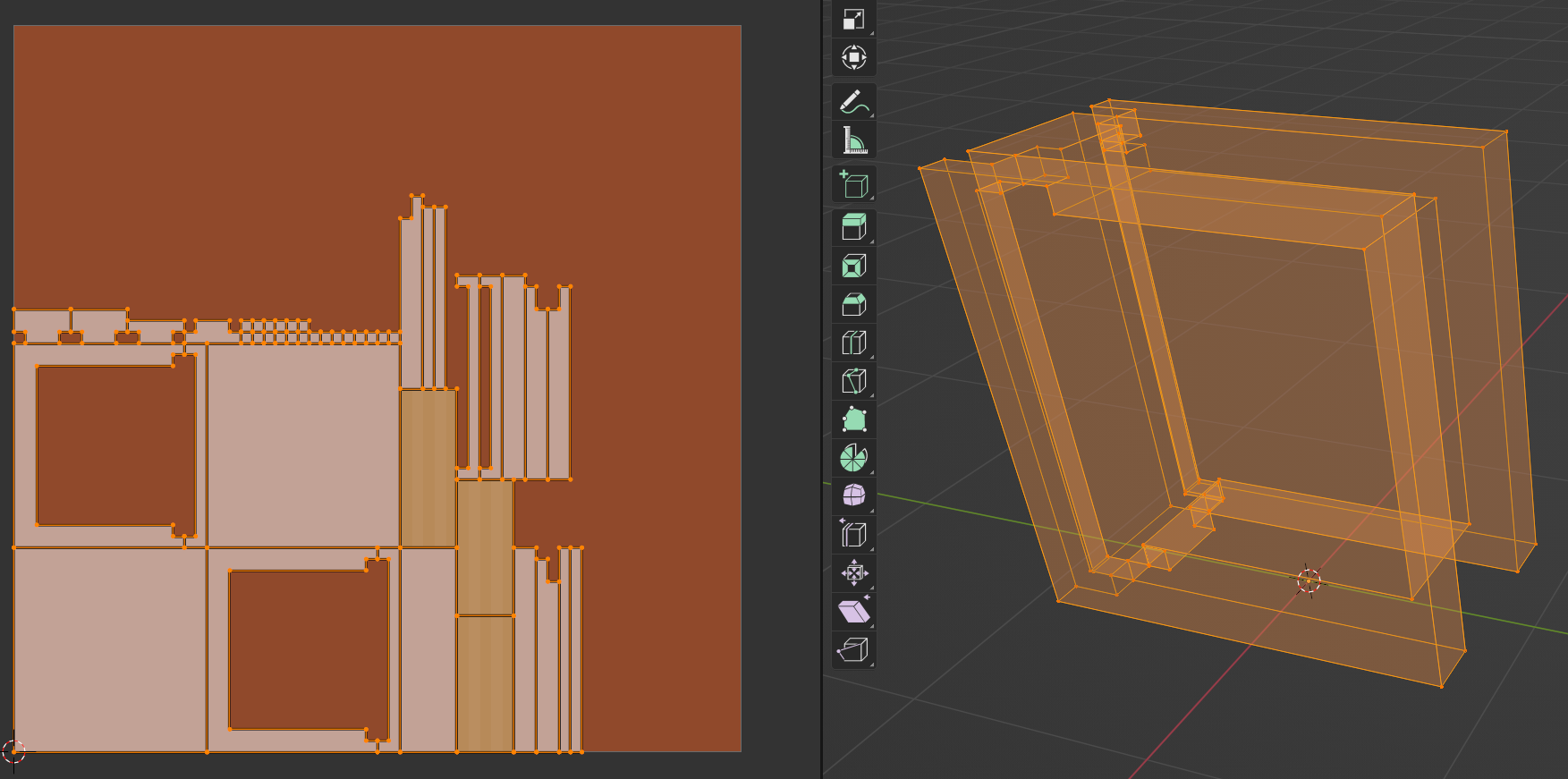
For future projects, spending time customising the Vox Cleaner python code to add padding would allow the workflow to be fully automated.
Shaders
Two key requirements for the shaders; item customisation, and transparency. Shader Graph was used to create a basic shader to meet these requirements.
- Colour change - Uses the ‘Replace Colour’ node and swap a defined colour with a colour set by the shader inputs.
- Transparency - Uses the ‘Colour Mask’ node to get all fragments of a defined transparency colour, then lerps them using a shader input transparency value as T, then passes this value to the alpha.
Smoothness and metallic values could also be adjusted.
Resolution & Windowed Mode
Development took place in a 4:3 ratio, 1024 x 768. This was chosen as a throwback to older PC style games, and to help sell the boxy visual style.
Later in the project the game was tested on modern ratios, and the feel of the game dramatically changed. UI scaling was not correctly set up, and too much of the house exterior was shown. So a decision was made to lock the visuals to 4:3.
This would mean Fullscreen mode in most resolutions would display the game with black bars, or stretched.
In early 90s, the PC had a number of games that would be windowed by default. This meant they could remain open while other work went on. A good example of this is Creatures 2.
In a game with enough dynamic features, having the world organically change while in the background can be a relaxing experience.
 Chill out while you work!
Notes: I can’t say whether this is a good idea, but making Indie games is about taking risks!
Challenge: Consistent world colours
Players are able to change colour values for objects in the world via a limited colour picker.
The picker limits players to changing the Hue only, allowing the game to control consistency with saturation and lightness (value).

HSV Cylinder
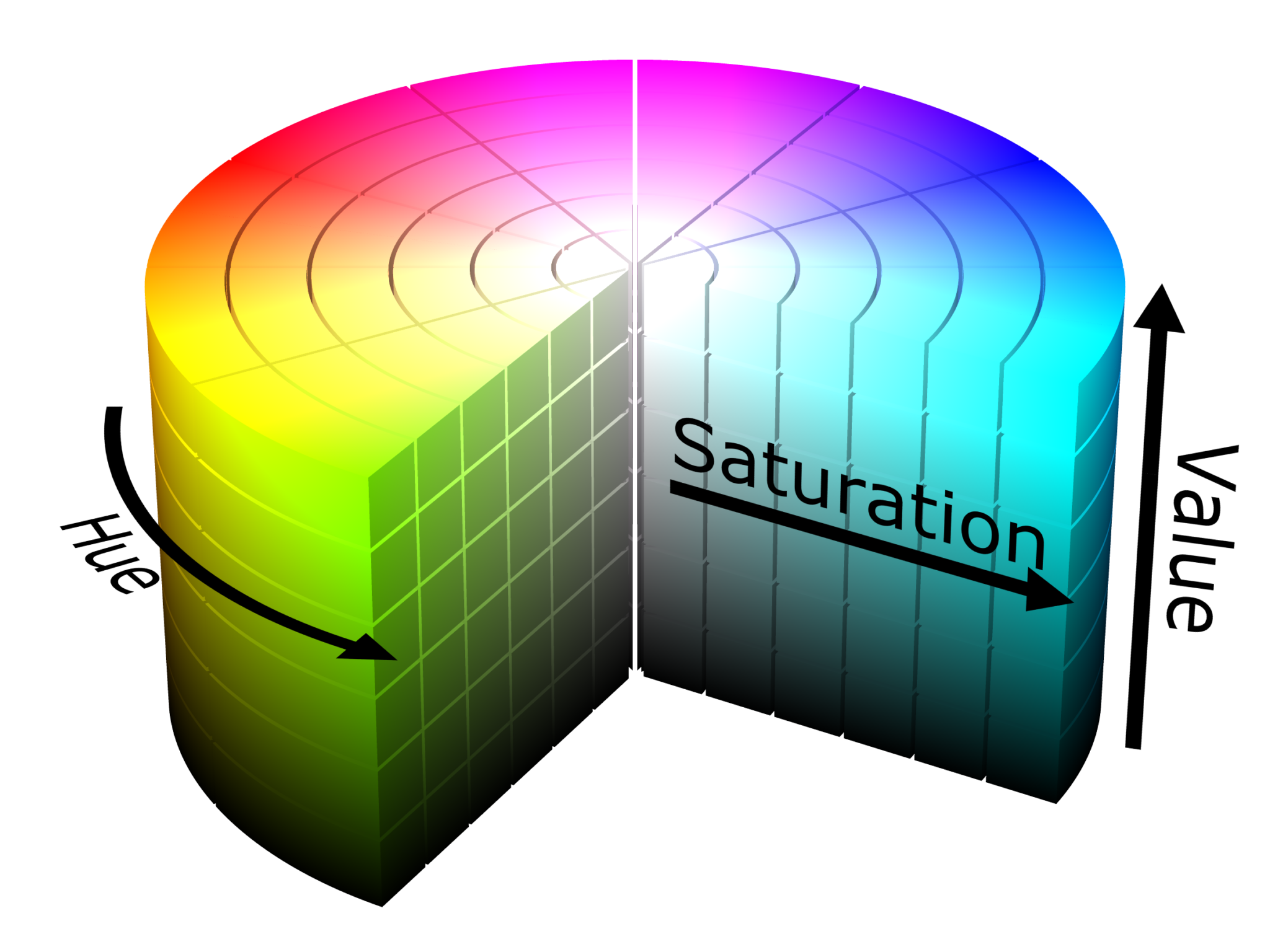 As with the ‘square’ rule, this was forgotten in a few instances, notably in the colour randomiser which spawns objects with a set list of colours.
A sensible starting point would have been taking the Saturation and Value from the UI colour choices, and locking everything else to these values with only the hue adjusted.
Challenge: UI Colour Integration
As detailed in the UI section, a pink/blue two tone colour was used for the UI. This was chosen in isolation, without any regard to visual consistency.
Some objects would randomise their colours to the UI colours, but the main source of integration to the world would be a sky with matching colours. Due to time constraints, this was not implemented.
Pink / Blue Sky
Lighting
Real-time lighting was used in this project due to challenges with light leakage due to UVs with no padding. See this for details: Challenge 3D Model Workflow
Lighting should have been given more time, and will be for future projects.
Environment
Limited time was given to the environment, the player spends most of the time looking at the house. Environments all used the Low Poly Nature pack, the untextured look of the objects in the pack fit in well with the voxel style of the house assets.
Environment Concept The players view is constrained to the house, the front porch of the house, and two windows. This limits the time spent on environment art.
Rough concept for the environment is below,
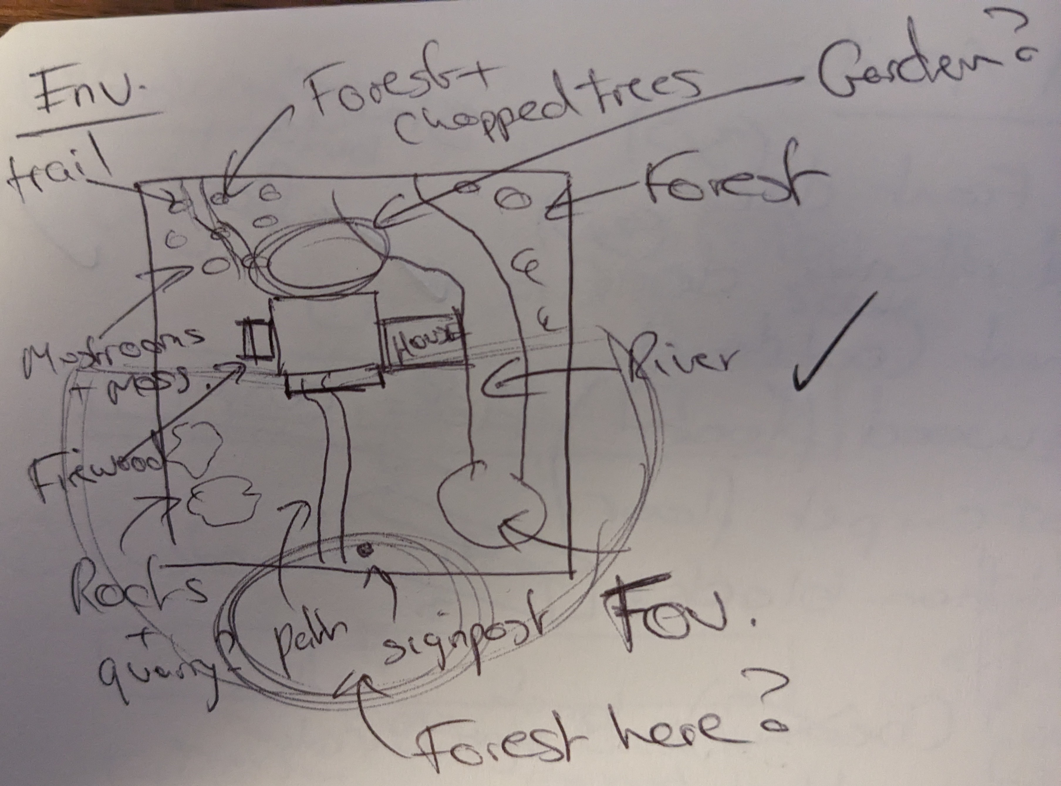
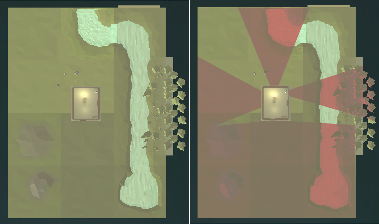
Below is the final environment. Terrain is in place, but assets are very limited. Environment art was de-scoped to focus on core systems. The right image shows player visibility, which is where environment work would focus.
Breaking up the horizon was not done, but ideally low-poly mountain terrain would be placed in front of the house to break up the view when the player is on the front porch, other views would have a flat horizon and forest boundaries.
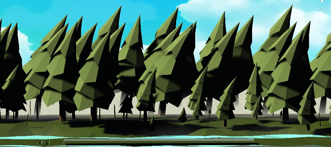
Some prototype work was done on an example of level boundaries with ‘dense’ forest. This effect uses tree placement and a fog plane to create the effect.
Using the modular terrain was simple, and allows easy manipulating of terrain with PolyBrush, but asset placement felt a little cumbersome. In the future, invest in a prefab tool which is more fit for use.
Project Management
The first commit was 16/11/23, and the final commit was 04/01/24. There is likely to be one last day of polish.
A Kanban board was maintained up until the last week. Although there were no defined Milestones, there were progress videos at key points in the project.
Progress Video: 14/11/23
Progress Video: 21/11/23
Progress Video: 25/11/23
Progress Video: 05/12/23
Overall
Total time: ~35 days
Assets & Coding: 55% Learning: 20% Bugfix & Issues: 15% Workflows: 10%
Workflow and learning times will decrease next project.
Animation, Audio, VFX
Animation, audio and VFX are very limited due to time constraints.
Elements have been when needed for player indicators, or where we’re looking to meet core design goals,
- ‘Pop’ sound on spawning and detatching objects. This is an indication for the user that an object is now selected.
- Fireplace. Good example of the interaction system adding dynamics (light, sound and animation) to the room.
- Window opening. This animation added as an example of a reward for user interaction, and the view out the window showing off the environment art. De-scoped was birdsong being added to the background when the window was open.
- Walk head-bob and footsteps. Added so the player doesn’t feel like they’re floating around the room in first person mode.
Music and background sound were not added to the prototype. Here is the intention with the music and background,
- LoFi chillout beats for the main menu.
- Limited ambient sound when playing the game initially, but background elements are added as rewards for player interaction. E.g. birdsong when the window opens.
- Unlock a Gramophone where LoFi tracks can be played in the background.
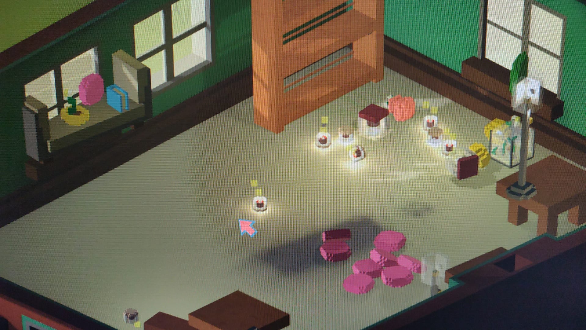
VFX are limited. A candle flame/heat VFX was added using the Unity particle system. This demonstrates a ‘square’ particle style, which ties into the core voxel art style.
Out-Of-Scope Ideas
Cleaning - ‘Simulator’ games, such as Power Wash Simulator and Lawn Mowing Simulator show players enjoy organisation and cleaning tasks. We can add this element to the opening of a level. E.g. clearing cobwebs, dusting, getting rid of broken shelves.
Item Deletion - Throw items into the lit fire to destroy them, or out the front door, or out a window. This fits nicely into our design principals; it’s low complexity as we aren’t adding additional actions for deletion, it ties into exploration as the fire, door and window need to ‘activated’ to allow the action, and it ties the player into the world.
‘Over-time’ Dynamic Events - Candles will melt over time, and the fire will go out eventually. These events are small rewards for players who continue to play. This is similar to the way an idle clicker game rewards players, but progression is never blocked by these events.
Design tweaks following feedback
Problem: Difficult to select objects when they’re on top of a focusable object, as sometimes you jump into focus mode. Solution: When hovering over a focusable object, change the cursor style.
Comments: Built a system for swapping the cursor based on the object being hovered over, e.g. colourable wall, light switch. However, this was scrapped as the cursor was changing all the time in Build mode. In Photo mode, interactable triggers were given a gold colour to indicate they could be clicked.